Thursday, 9 May 2013

quick typeface

this is a typeface I made in about 2 minutes using different sauce. I did it to see the kind of effects I could get from the sauce. As when it comes out of the bottle it is rather unpredictable and comes out at different speeds etc it makes an interesting typeface with different thickness and texture.

Abstract typeface

This is a typeface that I made using just one of my doc marten boots. I tried to find different sections of the boot that looked like letters and managed to construct an a-z alphabet. Although the letters are hard to read, I think it makes an interesting typeface which relates to me because I love my docs.

Wednesday, 8 May 2013

more simple type

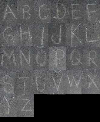
This is another quick typeface I made by simply drawing on tarmac with a stone. I like the textures in the images when they are larger. Although it is a simple typeface, I can imagine it being used for something involving children or school etc.

quick typeface

This is a quick, simple typeface I designed. On a sunny day, I took advantage of it and used the weather as an excuse to go outside. I created this typeface quickly by drawing on the concrete in my front garden with water. I like the way it looks because it looks so freehand and handcrafted just how it should do.

Photography in type

I have played with shadows and this is a technique which is very popular for people with cameras. I would like to create a typeface like this for my nmp, maybe with a laser pen or a torch. This typeface is created using fire. It should be quick, simple and enjoyable to make.

simple objects for typefaces

I love these typefaces. They are examples of how simple it is to make letters out of any object. Just by making some quick adjustments and changes, a full alphabet can be made simply out of objects such as these.

Tuesday, 7 May 2013

Animal Typography

I went to Chester Zoo yesterday, so I used this as an oppurtunity to create another new typeface. I took many photographs of various different animals so I have created this simple typeface made by cutting sections from the photos and making letters from different animals patters and textures.


Tetris Typeface


This is another typeface that I designed. It is based around my love of Tetris. I made the letters using only the blocks that are used in the game and kept them all equivelant to each other in size. I also wanted the letters to look realistic (as though they were made like this in the game). So I tried to place the shapes in a way that would be possible while playing. Most are accurate but I admit some I had to cheat to make them into readable letters.

Friday, 3 May 2013

Water type

I really love how this typeface looks. I really like the idea of making type with water. I think this will be one to add to my list of ideas for typefaces...  I think making a typeface with water will be very awkward and difficult and will take multiple attempts to make the letters readable and look effective but I think it could also be very rewarding.

Typeface design


I have designed various typefaces so far for my nmp, however this is my favourite currently. I really enjoy playing with basic things such as light and dark so I decided to put my photography skills to the test and play with shadows. First I designed a typeface by making quick stencils of A-Z and putting a bright light behind the paper and having a camera on a tripod taking photos of each one in turn. 


I had a lot of fun creating this typeface, but is I also like the idea of using the body to make typefaces, which is why I created this typeface:


Each letter is created using my hands and the shadows that projected on my wall. I created the typeface, again using a bright light behind my hands (in the same way as previously) but I think this idea is way more unique and creative.

Thursday, 28 March 2013

handdrawn type


This is a piece of typography work designed by a girl from the illustration pathway- Jennie Skeletons.

I asked her to upload this because I really love the feel of the octopus in the type. Just by adding the simplest of things to some type can make it feel completely different.

The type has a very fluid look to it and emphasises the idea of a sea creature or something living that moves, and the texture of the lettering illustrates that of an octopus.

Monday, 25 March 2013

Natural materials in type


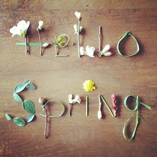
Handmade type is my favourite kind of typography. I especially appreciate typefaces made from natural materials and this is what makes this piece special. 

Although the typeface is not drawn and it is made from leaves, flowers and stems, the materials are still used very well to make beautiful letters. Obviously the fact that the piece says "Hello Spring" makes it obvious what the message is, even without these words, a similar feel could be expressed just through any words due to the materials used.

Thursday, 21 March 2013

And it begins...


Hello, my name is Jenny and this is my blog, all things type. 

I have a great passion and interest in typography in all contexts and forms and this is why I have created a blog to share my interests and show my own creations. I have decided to aim for a typeface style per day from the beginning of my NMP at university all the way to the end. I have various ideas and I have been inspired by different typographers and artists as well as my own interests and the world around me.

This blog will for part of my final major project of my Graphic Design course.